Climate in Murujuga
Murujuga is land and sea country is the north-west of Australia, which has been home to Aboriginal people for at least 50,000 years. The climate dramatically changed over this time, which must have impacted the way people lived (McDonald 2015). My PhD project focuses on how people responded to the regional climate during the Holocene (the last 10,000 years). The hydroclimate is important because it controls the amount of fresh water available to human populations.
Murujuga’s current climate is highly seasonal - with most of the water coming from monsoonal rainfall between December and March. But what was it like in the past? I hope to develop some new ways of answering this question over the next few years, but let’s start with reconstructions that are already available.
Using PHYDA
The PHYDA product (Steiger et al. 2018) is a reconstruction of global hydroclimate for the last 2,000 years. It was produced by assimilating 2,978 climate proxy records into a climate model using an ensemble Kalman Filter. It contains spatial reconstructions of 2m air temperature, and two water availability indices: PDSI and SPEI. It also includes indices calculated from the reanalysis: monthly Niño SST indices, the North Atlantic SST index, the equatorial Pacific zonal SST gradient index, and the latitude of the intertropical convergence zone (ITCZ) in different regions.
The product is available in the Zenoda repository. There are three ~4GB netcdf files, one using a model at yearly resolution (April-March), one for the boreal growing season (June-August), and one for the austral growing season (December-February). This code assumes all three are in your download folder. It can be loaded into R with {ncdf4}. There are many time-series’ of variables available, some spatial and some indices. You can display much more detailed metadata with print(nc_data).
Show code
 [1] "tas_mn"       "tas_sg"       "tas_pc"       "pdsi_mn"
 [5] "pdsi_sg"      "pdsi_pc"      "spei_mn"      "spei_sg"
 [9] "spei_pc"      "Nino_12_mn"   "Nino_12_sg"   "Nino_12_pc"
[13] "Nino_3_mn"    "Nino_3_sg"    "Nino_3_pc"    "Nino_3.4_mn"
[17] "Nino_3.4_sg"  "Nino_3.4_pc"  "Nino_4_mn"    "Nino_4_sg"
[21] "Nino_4_pc"    "PacDelSST_mn" "PacDelSST_sg" "PacDelSST_pc"
[25] "Atl_mn"       "Atl_sg"       "Atl_pc"       "Pac130_mn"
[29] "Pac130_sg"    "Pac130_pc"    "Pac160_mn"    "Pac160_sg"
[33] "Pac160_pc"    "EPac_mn"      "EPac_sg"      "EPac_pc"
[37] "WPac_mn"      "WPac_sg"      "WPac_pc"      "SAsia_mn"
[41] "SAsia_sg"     "SAsia_pc"     "IndOcn_mn"    "IndOcn_sg"
[45] "IndOcn_pc"    "SAmer_mn"     "SAmer_sg"     "SAmer_pc"
[49] "Ind_mn"       "Ind_sg"       "Ind_pc"       "Afr_mn"
[53] "Afr_sg"       "Afr_pc"       "EAfr_mn"      "EAfr_sg"
[57] "EAfr_pc"      "gmt_mn"       "gmt_sg"       "gmt_pc"
[61] "amo_mn"       "amo_sg"       "amo_pc"
The proxy dataset is also available on Zenodo. It’s in a matlab format, but can easily be read using R. Note that around north west Australia there are very few records. In fact, the speleothem from Flores is the only record in the region that spans the 2,000 year time-series1.
Show code
proxies <- readMat("~/Downloads/proxydata_aprmar_lmr_v0.2.0_pages2k_v2.mat")
proxies_df <-  tibble('msrmt' = unlist(proxies[["msrmt"]]),
                      'archive' = unlist(proxies[["archive"]]),
                      'names' = unlist(proxies[["lmr2k.names"]]),
                      'lat' = unlist(proxies[["p.lat"]]),
                      'lon' = unlist(proxies[["p.lon"]])) %>%
  st_as_sf(coords = c("lon", "lat"), crs = 4326)

#using the metbrewer nattier pallette
pal <- colorFactor(c("#022a2a",'#184948', '#7f793c',
                     '#52271c','#c08e39',"184948"),
                   levels = c("Marine Cores",'Lake Cores',
                              "Tree Rings","Speleothems",
                              "Corals and Sclerosponges",
                              "Ice Cores"))

leaflet(proxies_df) %>%
  setView(lng = 116.84438, lat = -20.73488, zoom = 1) %>%
  addProviderTiles(providers$CartoDB.Positron) %>%
  addCircleMarkers(color = ~pal(archive), label = ~names,
                   radius=6, stroke = FALSE, fillOpacity = 0.5) %>%
  addLegend(pal = pal, values = ~archive,
            position = 'bottomright', opacity = 1,
            title = "Proxy type")
Plotting the data
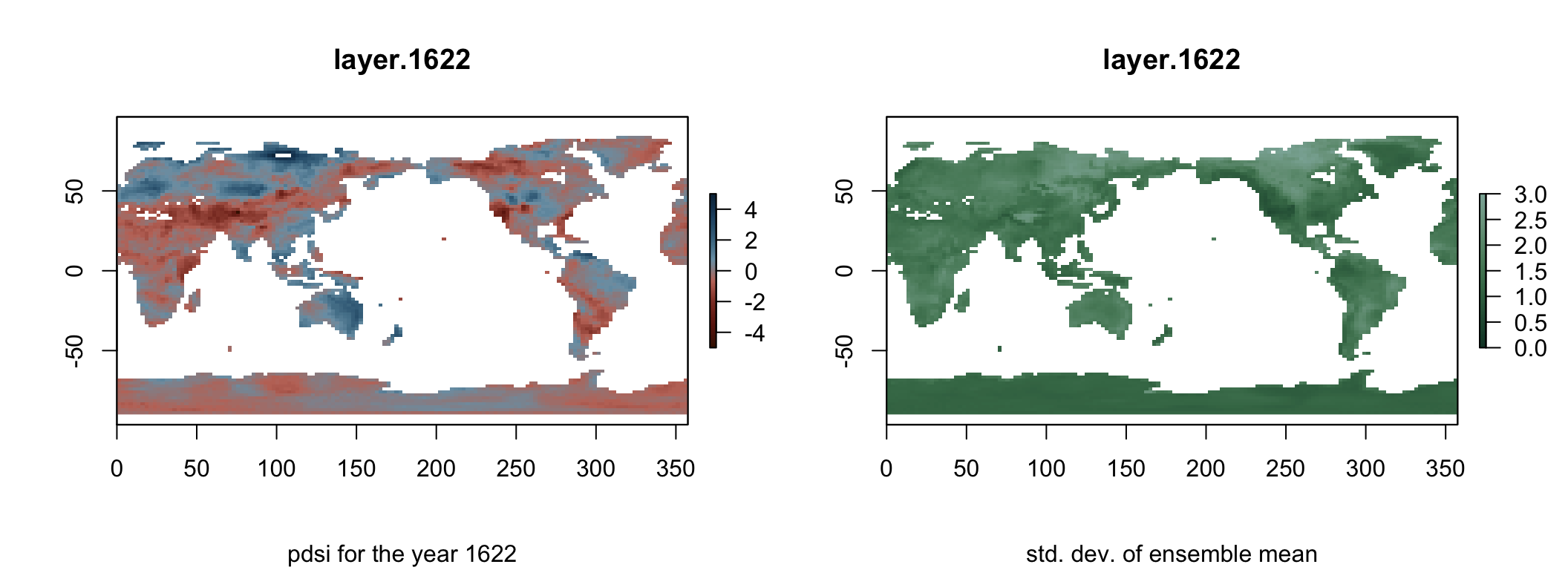
To visualise the water availability indices, you need to extract the matrix of the variable and convert it into a spatial raster. The mean PDSI over 100 ensembles gives the model’s best estimate, and is named pdsi_mn. The standard deviation of these ensemble members gives an estimate of uncertainty, and is named pdsi_sg. These can be plotted for the entire globe for any given year.
In the year 1622, it was dry in the northwest of Australia but relatively wet elsewhere on the continent. It is also apparent that there are different levels of uncertainty. For example, the model is slightly more confident around Indonesia than it is in Australia.
Show code
#get pdsi from netcdf
pdsi_mn <- ncvar_get(nc_data, "pdsi_mn")
pdsi_sg <- ncvar_get(nc_data, "pdsi_sg")

lon <- ncvar_get(nc_data, "lon")
lat <- ncvar_get(nc_data, "lat", verbose = F)
years <- ncvar_get(nc_data, "time")
crs <- CRS("+proj=longlat +ellps=WGS84 +datum=WGS84 +no_defs+ towgs84=0,0,0")

#make spatial layer from netcdf
r_brick <- brick(pdsi_mn, xmn=min(lat), xmx=max(lat),
                 ymn=min(lon), ymx=max(lon), crs=crs) %>%
  t() %>% flip(direction='y')

re_brick <- brick(pdsi_sg, xmn=min(lat), xmx=max(lat),
                  ymn=min(lon), ymx=max(lon), crs=crs) %>%
  t() %>% flip(direction='y')

#plot pdsi
par(mfrow = c(1, 2), oma=c(0,0,0,1))
rdbu <- colorRampPalette(met.brewer("Troy",n=15,type="continuous"))(100)
plot(r_brick, 1622, asp=1, col=rdbu, zlim=c(-5,5),
     sub='pdsi for the year 1622')

#plot standard deviation
grns <- colorRampPalette(met.brewer("Pissaro",n=15,type="continuous")[1:6])(100)
plot(re_brick, 1622, asp=1, col=grns,
     sub='std. dev. of ensemble mean', zlim=c(0,3))
Water availability in Murujuga
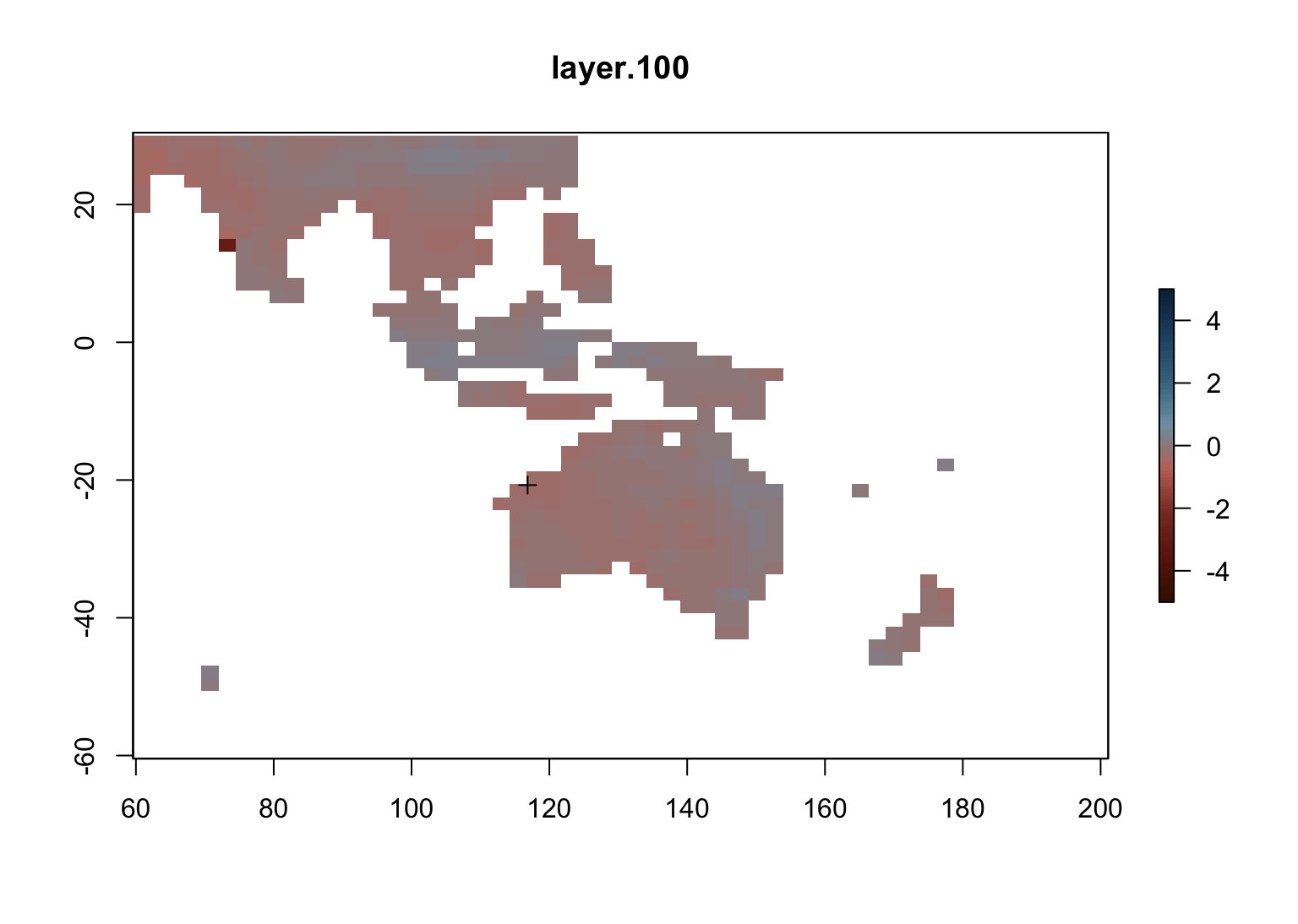
Data assimilation products like PHYDA are spatially complete, so you can extract a time series of any variable for any given location. In this case, each ‘layer’ corresponds to a different calendar year. Plotting these in order, you can see that climate across north Australia displays overall trends, but there is also regional variation. The cross in the north-west of Australia is placed on Murujuga, which we will extract a local record from.
Show code
#requires gifski to be installed,
#and uses animation.hook="gifski", interval=0.1 in the chunk header

#crop to just the Australian region, to improve speed
australia <- crop(r_brick, extent(60, 200, -60, 30))

#calculate the rolling average of 30 years ('macroweather')
mw <- calc(australia, function(x) movingFun(x, 30, mean))

#Define sampling point in Murujuga
sample_point <- SpatialPoints(cbind(116.84438,-20.73488))

#plot every 10 years, to be turned into a gif
#manual limits based on: min(mw@data@min);max(mw@data@max)
for (i in seq(100,1900,10)) {
  plot(mw, i, asp=1, col=rdbu, zlim=c(-5,5))
  plot(sample_point, add=T)
}
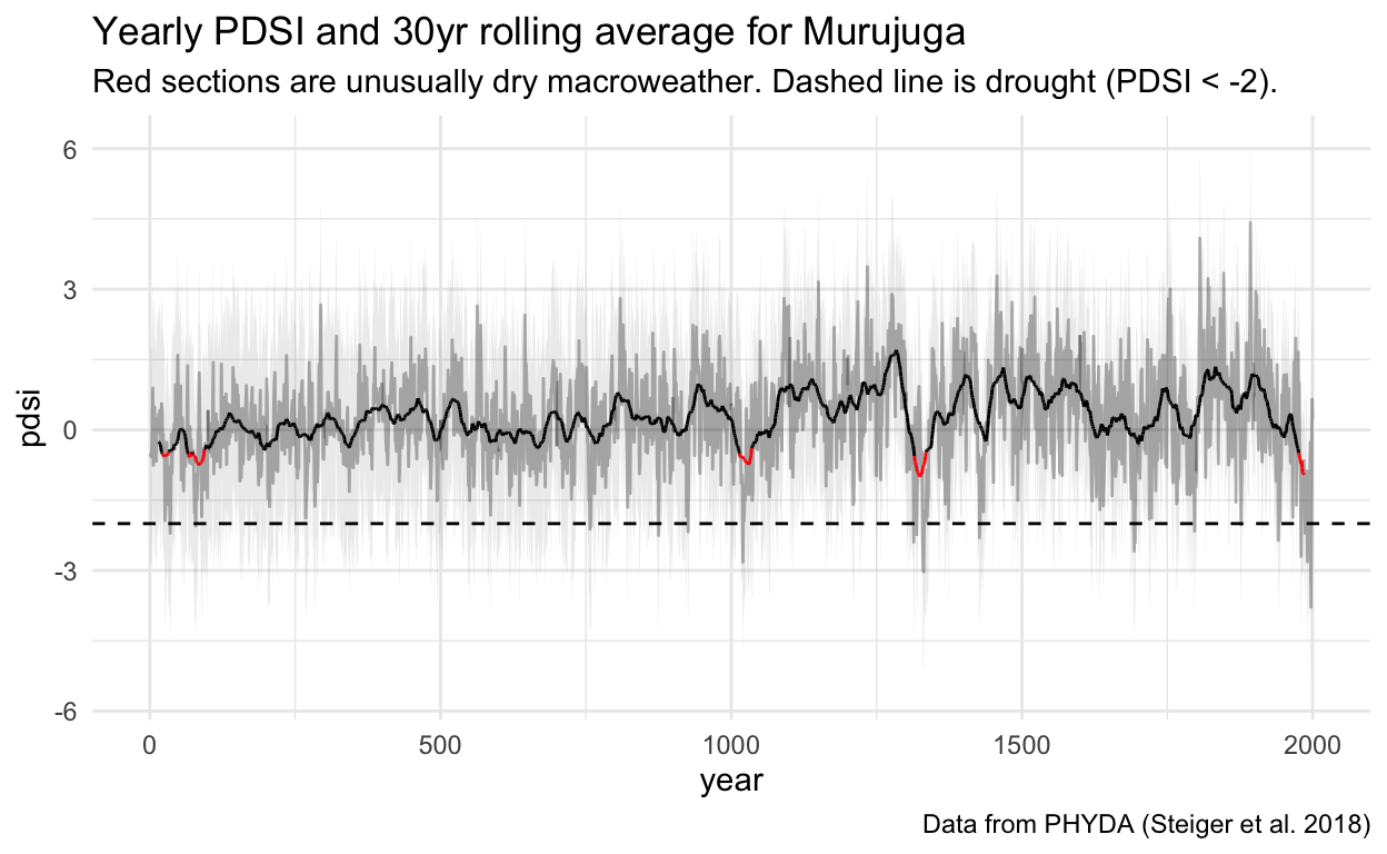
The climate trended overall wetter until the last 200 years, when it sharply dried. There are many droughts over this time. The macroweather conditions are of most interest to us, defined here as a 30-year rolling average (Lovejoy 2015). A threshold of 0.75 standard deviations below mean PDSI is defined as unusually dry (Ionita et al. 2021). Applying this threshold to macroweather reveals 5 periods of prolonged dry conditions:
21-32CE
66-93CE
1014-1034CE
1315-1334 CE
1976-? (the end of the dataset).
Show code
#Define sampling point in Murujuga
sample_point <- SpatialPoints(cbind(116.84438,-20.73488))
#Extract pdsi for Murujuga, and compute ci + rolling average
murujuga_pdsi <- tibble('year'= years,
                      'pdsi'=t(raster::extract(r_brick,
                                               sample_point, method='simple')),
                      'sd' = t(raster::extract(re_brick,
                                               sample_point, method='simple'))
                      ) %>%
  mutate(u = pdsi + sd,
         l = pdsi - sd,
         mw = rollmean(pdsi, 30, fill = NA))

mean_pdsi = mean(murujuga_pdsi$pdsi)
sd_pdsi = sd(murujuga_pdsi$pdsi)
dought_threshold = mean_pdsi - sd_pdsi*.75
drought_years = years[murujuga_pdsi$pdsi<dought_threshold]
drought_mw = years[murujuga_pdsi$mw<dought_threshold & !is.na(murujuga_pdsi$mw)]

#Plot pdsi
ggplot(data=murujuga_pdsi, aes(x=year, y=pdsi, group=1)) +
  geom_ribbon(aes(ymin=l, ymax=u), alpha= 0.1) +
  geom_line(alpha= 0.3) +
  geom_line(aes(y=mw, colour=years %in% drought_mw)) +
  geom_hline(yintercept = -2, linetype = 2) +
  labs(title = "Yearly PDSI and 30yr rolling average for Murujuga",
       subtitle = 'Red sections are unusually dry macroweather. Dashed line is drought (PDSI < -2).',
       caption = 'Data from PHYDA (Steiger et al. 2018)') +
  scale_colour_manual(values = c("FALSE" = 'black', 'TRUE' = "red"),
                      guide="none") +
  theme_minimal()
What are the climate drivers?
The Monsoon
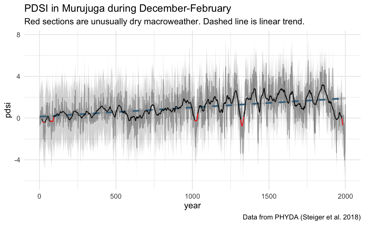
The dominating feature of Murujuga’s seasons at present is the Australian Monsoon, which manifests as the wet season between December and March. PHYDA has been resolved separately for December-February, which can be plotted in the same way as the annual product. This reveals that the amount of water in the system almost always increases over these months (PDSI>0), and that the ‘wet season’ has been a strengthening phenomenon for at least the last 2000 years (until recently). It shows more pronounced versions of the dips in the annual reconstruction, which implies that a weaker Monsoon has been the primary driver of drier periods.
Show code
nc_data_djf <- nc_open("~/Downloads/da_hydro_DecFeb_r.1-2000_d.05-Jan-2018.nc")
#Get pdsi from netcdf
pdsi_djf_mn <- ncvar_get(nc_data_djf, "pdsi_mn")
pdsi_djf_sg <- ncvar_get(nc_data_djf, "pdsi_sg")

#Make spatial layer from netcdf
r_djf_brick <- brick(pdsi_djf_mn, xmn=min(lat), xmx=max(lat),
                 ymn=min(lon), ymx=max(lon), crs=crs) %>%
  t() %>% flip(direction='y')

re_djf_brick <- brick(pdsi_djf_sg, xmn=min(lat), xmx=max(lat),
                  ymn=min(lon), ymx=max(lon), crs=crs) %>%
  t() %>% flip(direction='y')

#Extract pdsi for Murujuga, and compute ci + rolling average
murujuga_pdsi_djf <- tibble('year'= years,
                      'pdsi'=t(raster::extract(r_djf_brick,
                                               sample_point, method='simple')),
                      'sd' = t(raster::extract(re_djf_brick,
                                               sample_point, method='simple'))
                      ) %>%
  mutate(u = pdsi + sd,
         l = pdsi - sd,
         mw = rollmean(pdsi, 30, fill = NA))

#Plot pdsi
ggplot(data=murujuga_pdsi_djf, aes(x=year, y=pdsi, group=1)) +
  geom_ribbon(aes(ymin=l, ymax=u), alpha= 0.21) +
  geom_line(alpha= 0.3) +
  geom_smooth(method='lm', linetype = 2, colour="#44728c", size=1) +
  geom_line(aes(y=mw, colour=years %in% drought_mw)) +
  labs(title = "PDSI in Murujuga during December-February",
       subtitle = 'Red sections are unusually dry macroweather. Dashed line is linear trend.',
       caption = 'Data from PHYDA (Steiger et al. 2018)') +
  scale_colour_manual(values = c("FALSE" = 'black', 'TRUE' = "red"),
                      guide="none") +
  theme_minimal()
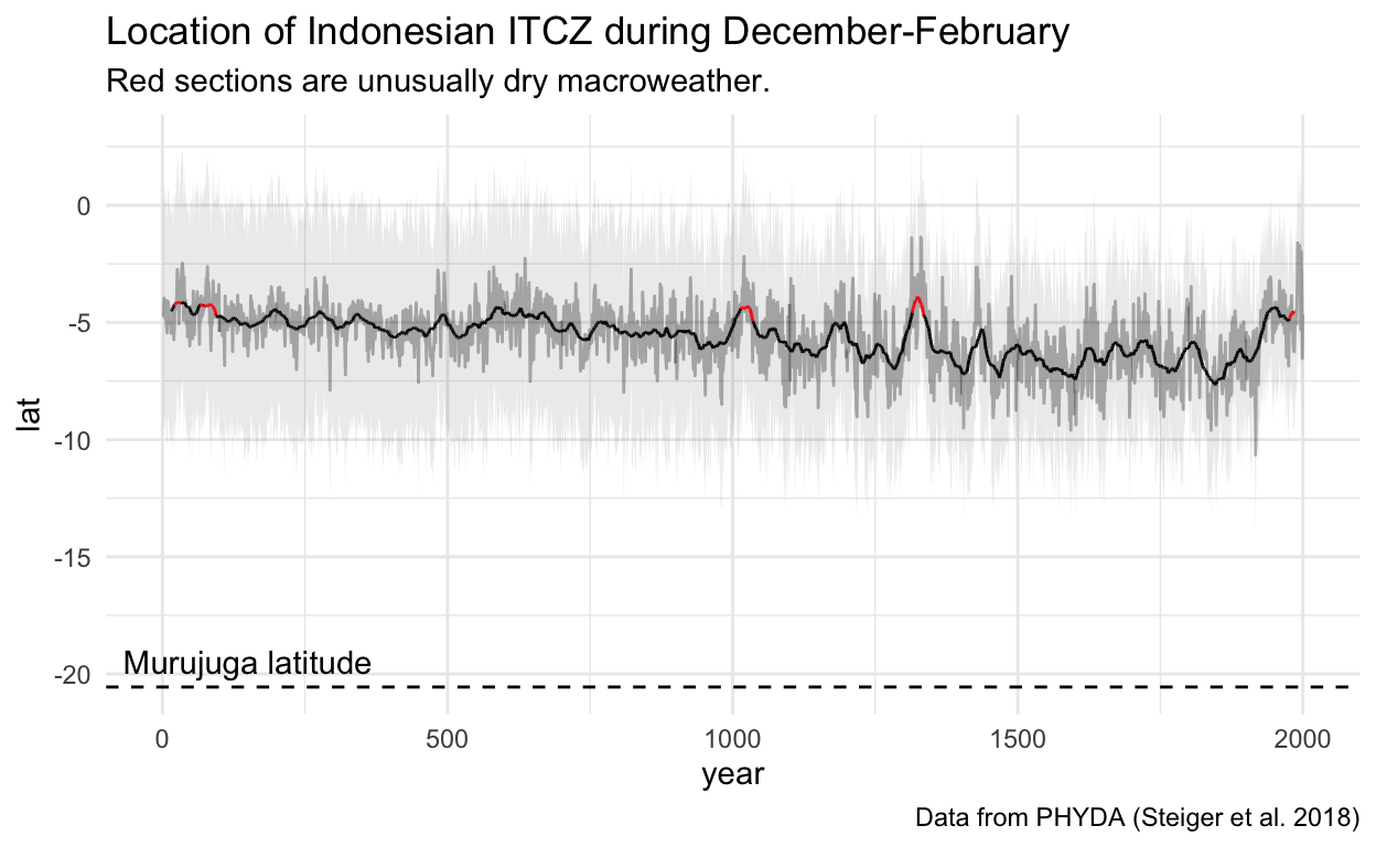
The ITCZ
The Inter-tropical Convergence Zone is a region of rising wet air around the equator. As Earth leans into the southern-hemisphere summer, the ITCZ moves down. This moves the wet air (and rain) over the north of Australia, forming the monsoon trough. During the dry periods in Murujuga, the ITCZ over Indonesia is unusually high, weakening (and shortening?) the monsoon’s effects.
Show code
#Extract itcz index for Indian region
itcz <- tibble("year" = years,
               "lat" = ncvar_get(nc_data_djf, "Ind_mn"),
               'sd'= ncvar_get(nc_data_djf, "Ind_sg")) %>%
  mutate(u = lat + 1.96*sd,
         l = lat - 1.96*sd,
         mw = rollmean(lat, 30, fill = NA),
         drought = year %in% drought_years)

#Plot itcz index
ggplot(itcz, aes(year, lat)) +
  geom_ribbon(aes(ymin=l, ymax=u), alpha= 0.1) +
  geom_line(alpha= 0.3) +
  geom_hline(yintercept=-20.5583,linetype = 2) +
  geom_line(aes(y=mw, colour=years %in% drought_mw, group = 1)) +
  scale_colour_manual(values = c("FALSE" = 'black', 'TRUE' = "red"),
                      guide="none") +
  annotate('text', x = 150, y = -19.5, label='Murujuga latitude') +
  labs(title = "Location of Indonesian ITCZ during December-February ",
       subtitle = 'Red sections are unusually dry macroweather.',
       caption = 'Data from PHYDA (Steiger et al. 2018)') +
  theme_minimal()
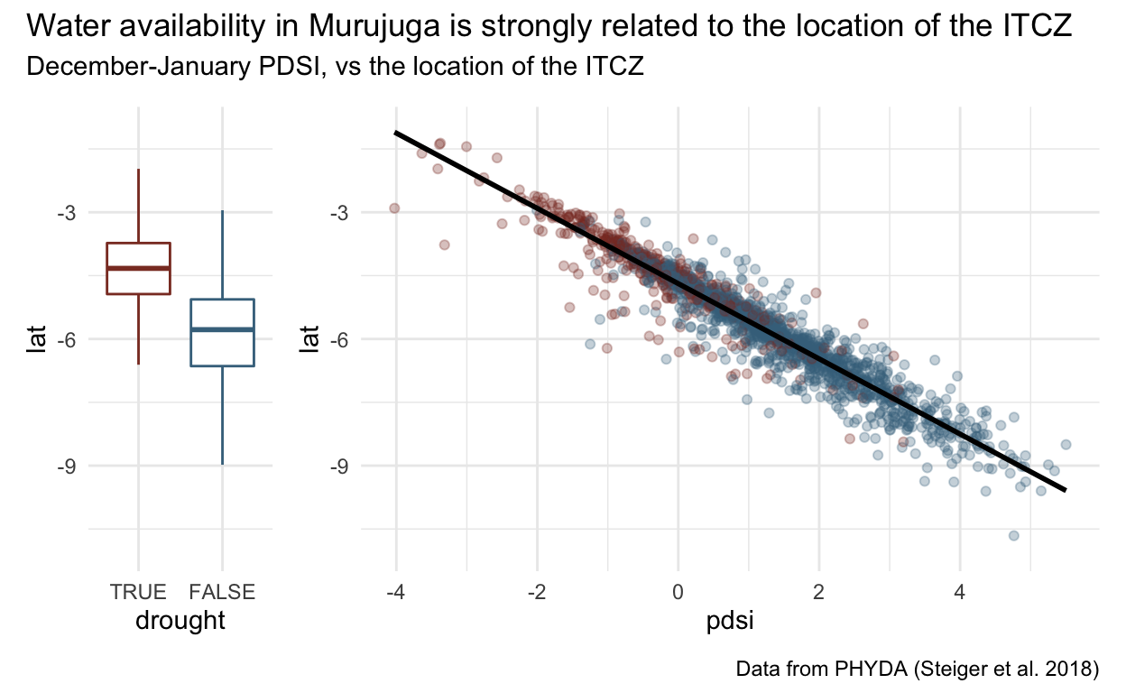
This location of the ITCZ can be plotted against the PDSI, and the dryness definition defined earlier. This reveals a very strong relationship between the latitude of the ITCZ and summer rain in Murujuga, and shows that that most drought conditions relate to a high ITCZ.
Show code
itcz_drought <- itcz %>% ggplot(aes(drought,lat)) +
  geom_boxplot(aes(colour=drought), outlier.alpha=0) +
  theme_minimal()  + guides(colour="none") +
  scale_x_discrete(limits=c("TRUE", "FALSE")) +
  ylim(c(-11,-1)) +
  scale_color_manual(values=c("#44728c", "#8b3a2b"))

itcz_pdsi <- full_join(murujuga_pdsi_djf, itcz, by ='year') %>%
  ggplot(aes(pdsi,lat)) + geom_point(aes(colour=drought), alpha=.3) +
  geom_smooth(method = 'lm', colour = 'black') +
  theme_minimal() + guides(colour="none") +
   ylim(c(-11,-1)) +
  scale_color_manual(values=c("#44728c", "#8b3a2b"))

itcz_drought + itcz_pdsi +
  plot_layout(widths = c(1, 4)) +
  plot_annotation(
  title = 'Water availability in Murujuga is strongly related to the location of the ITCZ',
  subtitle = 'December-January PDSI, vs the location of the ITCZ',
  caption = 'Data from PHYDA (Steiger et al. 2018)'
)
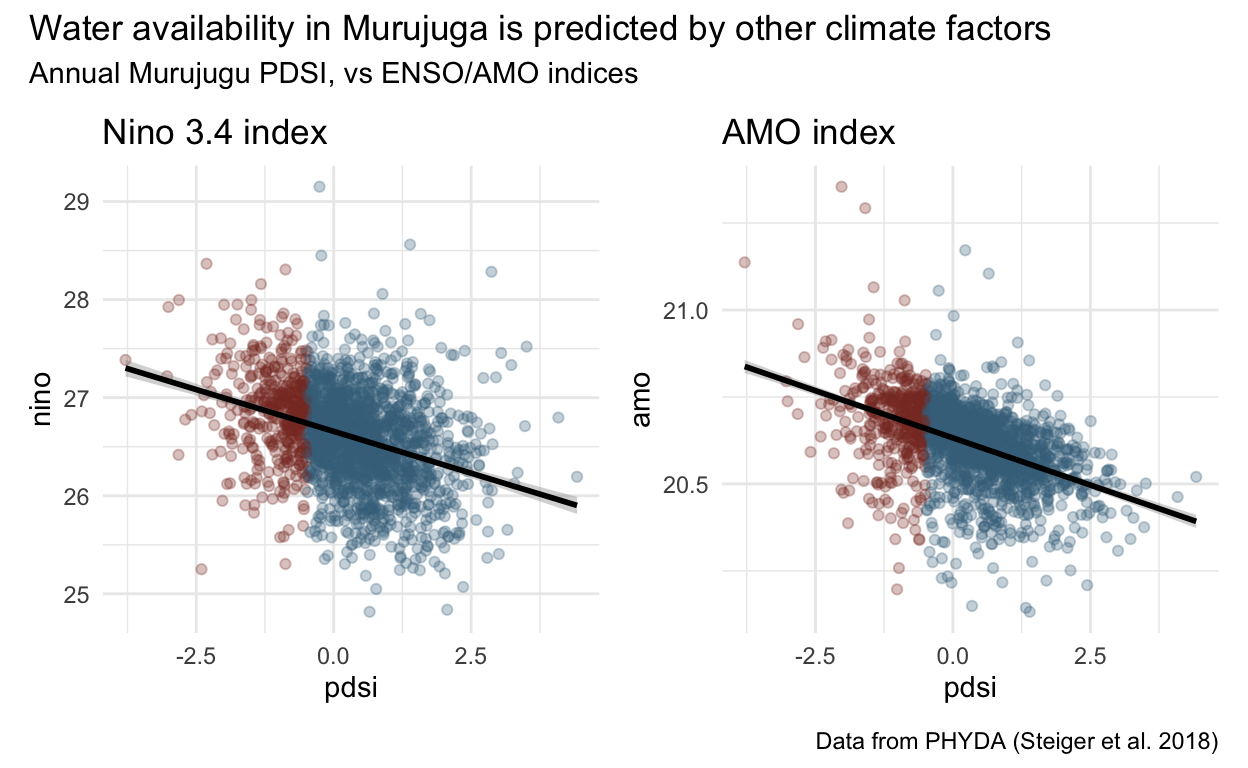
ENSO and AMO
The El Niño–Southern Oscillation (ENSO) and Atlantic Multi-decadal Oscillations (AMO) indices have been used to investigate the drivers of ‘megadroughts’ elsewhere (Steiger et al. 2019). Higher Ninõ 3.4 values (which are related to El Ninõ2) are associated with less water in Murujuga. The 1014-1034CE and 1315-1334 CE dry periods overlap with notable very strong El Ninõ years (Zinke et al. 2021). This is the opposite of megadroughts in North America, which are associated with strong La Ninās (Steiger et al. 2019). The AMO has a similarly strong relationship, which I cannot explain. More to come, as I develop some climate skills!
Show code
nino <- tibble("year" = (1:(2000*12))/12,
               "nino" = ncvar_get(nc_data, "Nino_3.4_mn"),
               'sd'= ncvar_get(nc_data, "Nino_3.4_sg")) %>%
  group_by("year" = floor(year)) %>%
  summarise(nino = mean(nino), sd = mean(sd)) %>%
  mutate(u = nino + 1.96*sd,
         l = nino - 1.96*sd,
         mw = rollmean(nino, 30, fill = NA),
         drought = year %in% drought_years)

nino_plot <- full_join(murujuga_pdsi, nino, by ='year') %>%
  ggplot(aes(pdsi,nino)) + geom_point(aes(colour=drought), alpha=.3) +
  geom_smooth(method = 'lm', colour = 'black') +
  theme_minimal() + guides(colour="none") +
  labs(title = 'Nino 3.4 index' ) +
  scale_color_manual(values=c("#44728c", "#8b3a2b"))

#Extract amo index
amo <- tibble("year" = 1:2000,
               "amo" = ncvar_get(nc_data, "amo_mn"),
               'sd'= ncvar_get(nc_data, "amo_sg")) %>%
  group_by("year" = floor(year)) %>%
  summarise(amo = mean(amo), sd = mean(sd)) %>%
  mutate(u = amo + 1.96*sd,
         l = amo - 1.96*sd,
         mw = rollmean(amo, 30, fill = NA),
         drought = year %in% drought_years)

amo_plot <- full_join(murujuga_pdsi, amo, by ='year') %>%
  ggplot(aes(pdsi,amo)) + geom_point(aes(colour=drought), alpha=.3) +
  geom_smooth(method = 'lm', colour = 'black') +
  theme_minimal() + guides(colour="none") +
  labs(title = 'AMO index' ) +
  scale_color_manual(values=c("#44728c", "#8b3a2b"))

nino_plot + amo_plot  +
  plot_annotation(
  title = 'Water availability in Murujuga is predicted by other climate factors',
  subtitle = 'Annual Murujugu PDSI, vs ENSO/AMO indices',
  caption = 'Data from PHYDA (Steiger et al. 2018)'
)
Acknowledgements
I’m trained as an archaeologist, but only just learning about climate science. Thanks to my PhD supervisors Jo McDonald, Mick O’Leary and Ian Goodwin for their continuous advice on this project. My work is funded as part of the ARC Dating Murujuga’s Dreaming project.
I did create a map with a graph of each of the proxy record available on click. It was too big (50mb) to embed in this post, so it is hosted separately, and the code is also available.↩︎
The Niño 3.4 index is normally used to define El Ninõ or La Ninā by comparing a three-month running mean to the ‘normal’ (detrended) SST. This is analysis is outside the scope of this post, so I’ve relied on the Zinke et al. 2021 reference.↩︎