Background
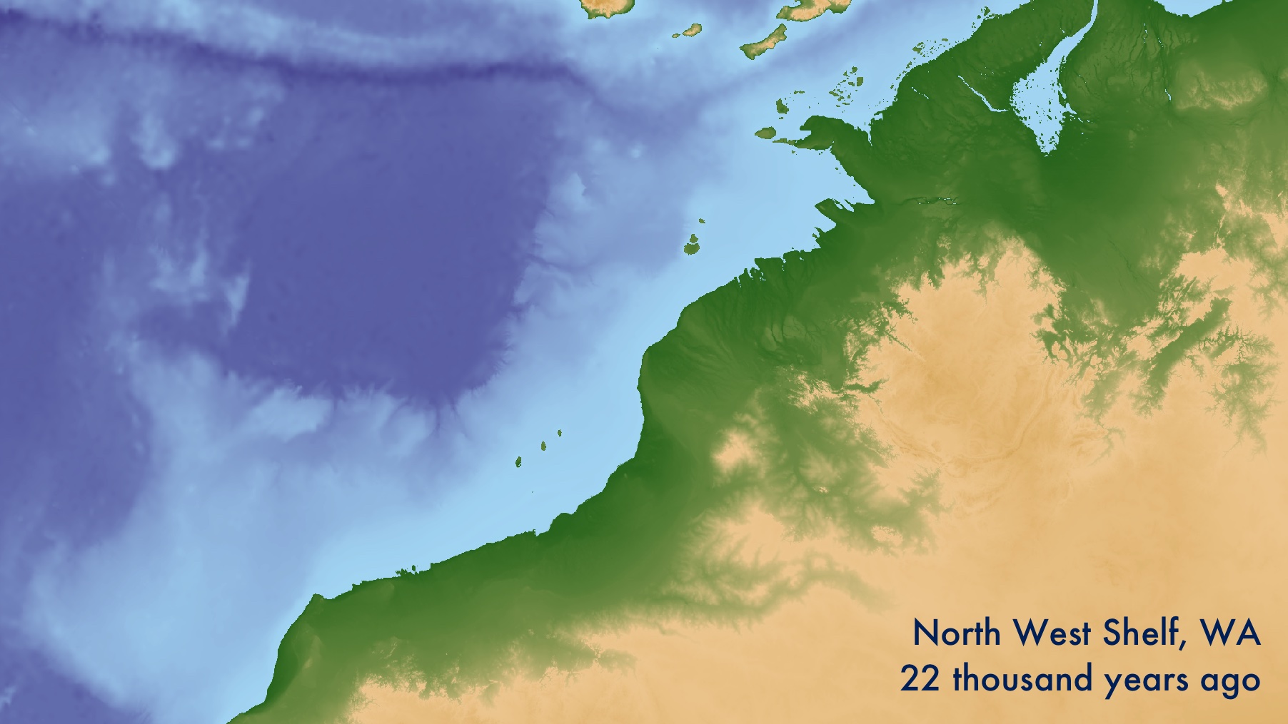
After the Last Glacial Maximum 22 thousand years ago, sea levels rose over 120m to form the present-day shorelines. The now-submerged landscapes on the continental shelf are of interest to archaeologists for their potential to contribute unique records of the human past. They must contain key evidence for major questions in archaeology such as human responses to climate change, the peopling of Australia and the Americas, the emergence of agriculture and the apparent emergence of modern human behaviour.
Locating past shorelines is a useful way of understanding the archaeological potential of submerged lands. This is difficult, and should be done carefully if the work has any potential impact 1. To do so confidently the geomorphology of remnant shorelines must be mapped using remote sensing of the sea bed and sub-bottom. Following this, features should be directly dated to build local sea level models. It is not unusual for 10-20+ m of sand and coral to have built up since inundation, or for sea level change in one part of the world to be many metres different from the global average.
For this exercise, we shall use open data to make a simple estimation of past shorelines using only 1) the depth of the seabed at present, 2) and the modelled global sea level in the past. Even though modern bathymmetry is a poor proxy for past landscapes, these maps give a general understanding of how the shoreline may have changed over the last 125,000 years. They are best regarded as hypotheses, to be updated with proper investigation. If you go on to generate more precise local models, that data can be substituted into this workflow.
- The full R code for this example is available on Github
- To map somewhere you choose, you will have need a GIS software such as QGIS. The DEM used here is available in the Github repository.
- You will need to install ffmpeg to combine the images into a movie.
Sea level curve
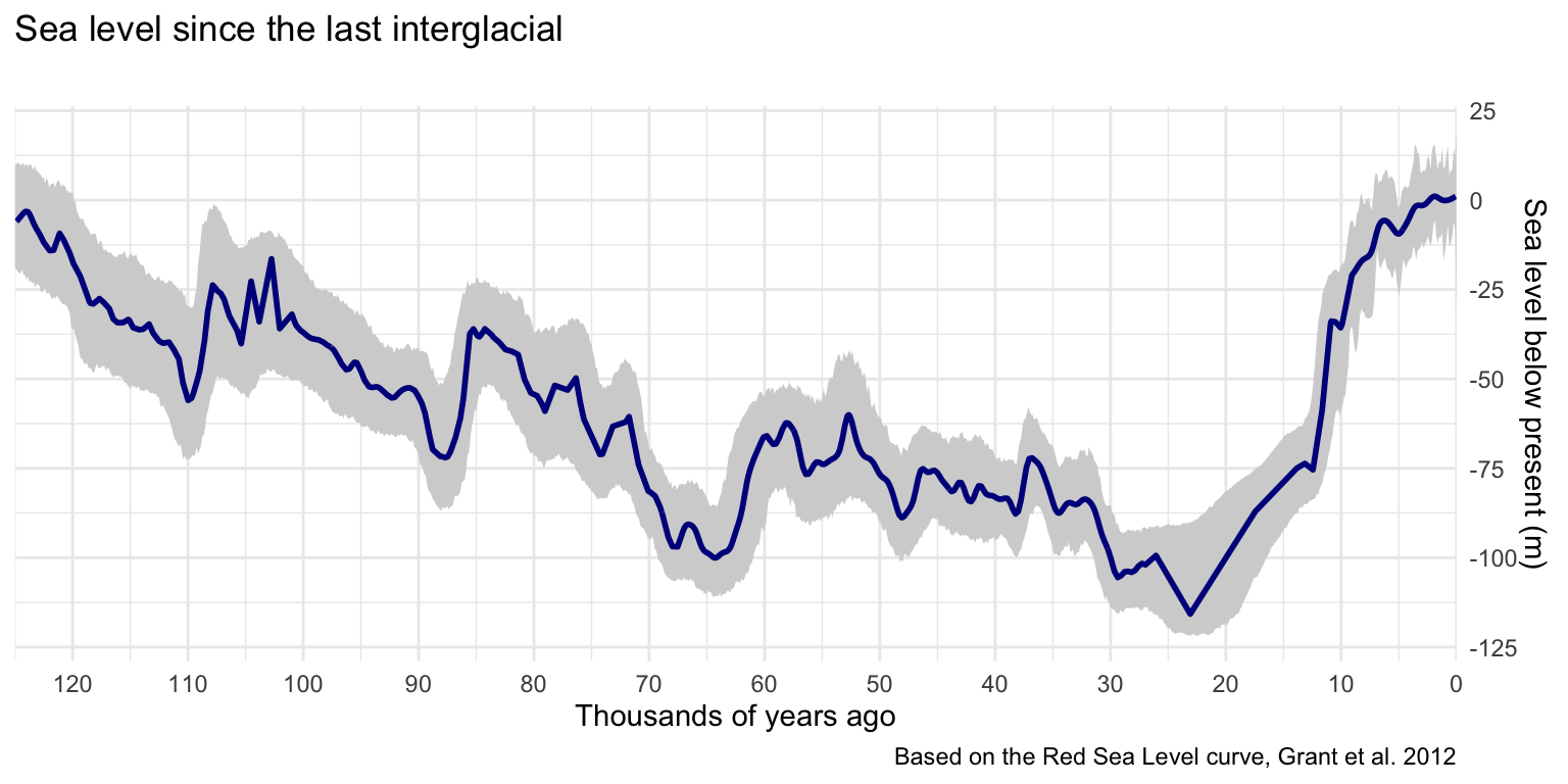
I’ve used the Red Sea Level curve from Grant et al. 20122 which is often cited because it is securely dated, spans the last 150,000 years, and has numbers available in the supplementary information. Using a combination of the dplyr and readxl packages (in the tidyverse), you can load in and isolate the final smoothed model values with their confidence intervals (CIs). I have imported the smoothed values and confidence intervals separately because they are represented in different time intervals.
The following code presumes you have the unmodified supplementary information table in your working directory as grant2012.xls.
library(tidyverse)
library(readxl)

grant2012 <- read_excel('grant2012.xls',
                        sheet = "(4) RSL", range = "E9:J1210")[-1,]

sealevel <- grant2012 %>%
  select(
    age = Age...1,
    smooth = RSL_smooth
  ) %>% mutate_all(as.double) %>% filter(age<=125)

ci <- grant2012 %>% select(
  ci_age = Age...4,
  upper = `RSL_95%upper`,
  lower = `RSL_95%lower`
) %>% mutate_all(as.double) %>% filter(ci_age<=125)

glimpse(sealevel)
Rows: 676
Columns: 2
$ age    <dbl> 0.069, 0.222, 0.324, 0.477, 0.579, 0.732, 0.808, 0.8…
$ smooth <dbl> 1.054000, 0.752000, 0.557000, 0.297000, 0.155000, -0…
Plotting sea level over time
Plotting the CIs is important because they can be quite substantial, and just metres of change in sea level can move a shoreline by kilometres. A geom_ribbon() is clear but unobtrusive. Once the CIs are on, overlay the geom_line() for the smoothed values. I chose to reverse the graph so time reads left-to-right, and to set the x-axis breaks at 10,000-year intervals for clarity.
ggplot() +
    geom_ribbon(data=ci,
                aes(x = ci_age, ymin=lower, ymax=upper),
                fill='lightgrey') +
    geom_line(data=sealevel, aes(age,smooth), colour="blue4", size=1) +
    scale_x_reverse(n.breaks=12, expand = c(0, 0)) +
    scale_y_continuous(n.breaks=6, position = "right") +
    labs(title="Sea level since the last interglacial", subtitle = "",
         x='Thousands of years ago', y='Sea level below present (m)',
         caption='Based on the Red Sea Level curve, Grant et al. 2012') +
    theme_minimal()
Simulating shorelines
The Geoscience Australia Australian Bathymetry and Topography Grid 3 has elevation data for the entire Australian continent at a 250m horizontal resolution. It is available as a 1.3Gb *.ers grid file.
The simplest method for extracting an area of interest is to load it into QGIS, frame the area in the window, and then export the layer cropped to the map canvas extent. An export projection of Google Maps Global Mercator is always reliable.
For this example, I’ve used the coast of Perth in Western Australia, including Wadjemup (Rottnest Island). You can import it using the raster package, then covert it to points for tidy manipulation. For consistency, it is best to also override the column names.
The principle behind the map is to calculate the height of any pixel in relation to sea level at the time, and use that to define the colour on the plot. You should define a function that takes any given row number in the sea level curve and an elevation value. It should then subtract the smoothed sea level for that row from elevation value you pass to it, returning the calculated elevation relative to past sea level.
simulate <- function (row, z) {
  z-sealevel$smooth[row]
}
Plotting the map
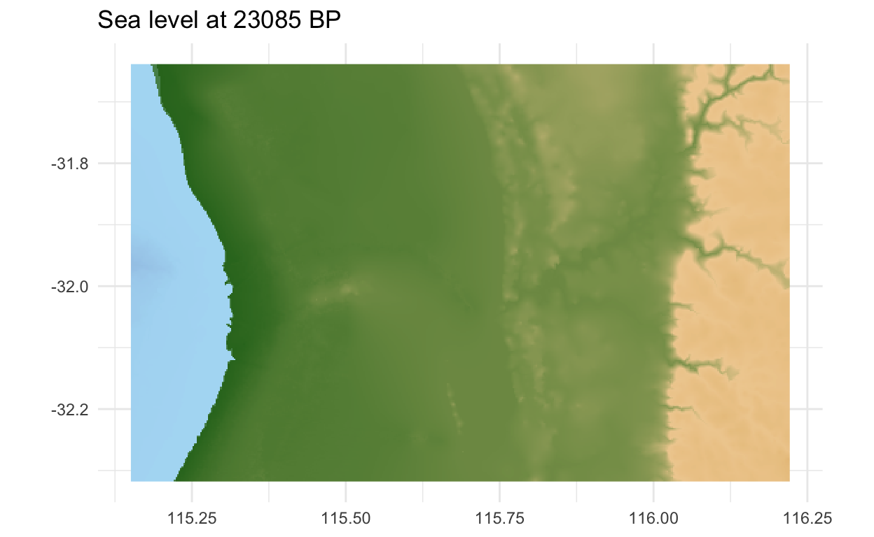
Now to make the maps! First define a row in the sea level table that corresponds to a time. Number 163 in this example corresponds the Last Glacial Maximum, when the sea levels were lowest. The fill aesthetic uses the elevation (z) value wrapped in the function we just defined, which will adjust the height above/below sea level according to time. A geom_raster() is a high-performance version of geom_tile(), best for drawing maps like this. The marmap package has a nice colour scale called 'etopo', which gives an intuitive impression of a landscape based only on height. Make sure the coordinates also are at an equal ratio. The final touch is the title, which pulls the age from the sea level table according to the row plotted.
If you are familiar with Perth, you will notice the Swan River was far inland, and Rottnest Island was then a hill.
library(marmap)
time_to_plot<- 163
ggplot(land, aes(x,y, fill=simulate(time_to_plot, z))) +
    geom_raster() + scale_fill_etopo(guide = FALSE) +
    coord_equal() +
    labs(title=paste("Sea level at", sealevel$age[time_to_plot]*1000, "BP"),
         x=NULL, y=NULL) +
    theme_minimal()
Animation
The code to produce the static figures can be simply adapted to output many frames, which can be combined into a video file.
Interpolating the sea level curve
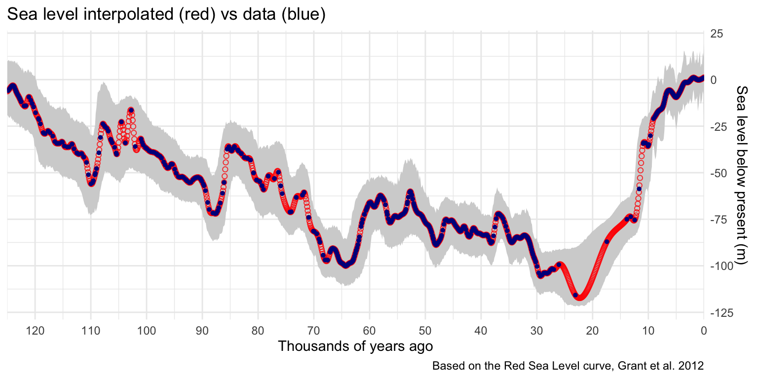
To make a smooth animation the sea level curve must be interpolated. Without this step, the irregular sampling will create a jittery animation with inconsistent flow.
First the desired time intervals are generated using a seq() command, in this case at every 100 years between 0 and 125,000. Then a smooth.spline() model is fit to the data, fixed so it will always pass through every known point. This spline can then be used to estimate sea level between the known points at regular intervals. It is important to check this step because sometimes models can do unexpected and unrealistic things. As you can see from the graph below this method seems a reasonable fit.
Don’t forget to redefine the simulation function to use the interpolated values!
years <- seq(0,
             125,
             by = .1) #in ka

sea_spline <- with(sealevel, smooth.spline(age, smooth, all.knots=TRUE))

predictions <- predict(sea_spline, years) %>%
  as_tibble() %>%
  dplyr::select('age' = x, "smooth"=y)

simulate <- function (row, z) {
  z-predictions$smooth[row]
}

ggplot() +
    geom_ribbon(data=ci, aes(x = ci_age, ymin=lower, ymax=upper), fill='lightgrey') +
    geom_point(data=predictions, mapping = aes(age, smooth),
               alpha=.8, colour='red', shape=1) +
    geom_point(data=sealevel, aes(age,smooth)
               , colour="blue4", size=1) +
    scale_x_reverse(n.breaks=12, expand = c(0, 0)) +
    scale_y_continuous(n.breaks=6, position = "right") +
    labs(title="Sea level interpolated (red) vs data (blue)",
         x='Thousands of years ago', y='Sea level below present (m)',
         caption='Based on the Red Sea Level curve, Grant et al. 2012')+
    theme_minimal()
Making the animated map and graph
Wrapping the plotting code in a for loop allows you to cycle through each time step. This simply goes through the predictions row by row, using it to calculate relative sea level and fill in information in the labels. The graph also picks up a point and a vertical line to track the time. GGarrange() from the ggpubr package is used to plot the map and graph together. Finally, they are saved to a file using ggsave(). They are generated going backwards in time, which is interesting to watch develop, but named in reverse so that they can be sorted chronologically.
library(ggpubr)

for (time in 1:nrow(predictions)) {

  map <- ggplot(land, aes(x,y, fill=simulate(time, z))) +
    geom_raster() + scale_fill_etopo(guide = FALSE) +
    coord_equal() +
    labs(title=paste("Sea Level at", predictions$age[time]*1000, "BP"),
         x=NULL, y=NULL) +
    theme_minimal()

  graph <- ggplot() +
    geom_ribbon(data=ci, aes(x = ci_age, ymin=lower, ymax=upper),
                fill='lightgrey') +
    geom_line(data=predictions, aes(age,smooth),
              colour="blue4", size=1) +
    geom_point(data=subset(predictions, age==predictions$age[time]),
               aes(age,smooth), size=3) +
    scale_x_reverse(n.breaks=12, expand = c(0, 0)) +
    scale_y_continuous(n.breaks=6, position = "right") +
    labs(title="", subtitle = "",
         x='Thousands of years ago',
         y='Sea level below present (m)')+
    theme_minimal() +
    geom_vline(xintercept=c(predictions$age[time]),
               linetype="dotted", size=.3)

  ggarrange(map, graph,
            heights = c(2, 1),
            ncol = 1, nrow = 2) %>% return()

  ggsave(paste0(nrow(predictions)-time+1, "_rottnest_shelf.png"),
         height=9, width=9, bg='white')
}
Rendering into a video
For this final step, it is best to step outside R and use ffmpeg. The terminal command below will take all *.png files in a folder, order them alphabetically, and quickly combine them into a high quality *.mp4 file. There are many other ways to render frames into a video - including in Quicktime or Blender.
cat $(find . -maxdepth 1 -name "*.png" | sort -V) |
  ffmpeg -framerate 25 -i - -c:v libx264 -profile:v high -crf 20 -pix_fmt yuv420p rottnest.mp4
The result below should give you a general sense for how Wadjemup (Rottnest Island) became disconnected from the Australian mainland. However, this could be dramatically improved by the use of local sea level models, and a consideration of the many metres of sand deposited since inundation.
Optimisation
Handling very large rasters
When plotting rasters larger than the output, some computation is done for no reason. Over thousands of frames, a few seconds in each loop can add up to several hours of waiting. The code below checks how many times you can divide the raster by 3000 x 2000 pixels, and if it is more than once it rounds down to the nearest integer. The aggregate() function from the raster package does the heavy lifting, and downsamples the raster by this factor.
land <- raster("rottnest_shelf.tif")
dims <- as.integer(min(dim(land)[1:2] / c(2000, 3000)))
dims <- ifelse(dims>=1, dims, 1)
land <- land %>% aggregate(dims, progress='text') %>% rasterToPoints() %>% as_tibble()
colnames(land) <- c('x', 'y', 'z')
Parallel processing
Multiple CPU cores can speed up this operation, because each step is independent. Make sure to monitor RAM usage, because if it needs to write to disk this will significantly slow the process. On a 150MB raster and 16 cores, I filled up 64GB of RAM almost immediately. Register a cluster of cores using the doParallel package, leaving one for the rest of your computer.
library(doParallel)
cl <- makeCluster(detectCores()-1)
registerDoParallel(cl)
We can use the foreach package to parallelise the for loop. Because these are separate environments, you will need to pass it the packages. Don’t forget to stop the cluster at the end.
King, J.W., Robinson, D.S., Gibson, C.L. and Caccioppoli, B.J., 2020. Developing protocols for reconstructing submerged paleocultural landscapes and identifying ancient Native American archaeological sites in submerged environments: final report. Sterling (VA): US Department of the Interior, Bureau of Ocean Energy Management, Office of Renewable Energy. OCS Study BOEM, 23, p.24. https://espis.boem.gov/final%20reports/BOEM_2020-023.pdf↩︎
Grant, K., Rohling, E., Bar-Matthews, M. et al. Rapid coupling between ice volume and polar temperature over the past 150,000 years. Nature 491, 744–747 (2012). https://doi.org/10.1038/nature11593,↩︎
Whiteway, T. 2009. Australian Bathymetry and Topography Grid, June 2009. Record 2009/021. Geoscience Australia, Canberra. http://dx.doi.org/10.4225/25/53D99B6581B9A
↩︎